MY TYPEFACES
Above is an alphabet for a modular typeface I created using vinyl-wrapped wire paperclips bent into different angles. The goal for each letter was to strategically use the doubled portion of the paperclips to create contrast from the single lengths of wire. I consider these varying appearances to be equivalent to the different stroke weights that create contrast within the glyphs of most typefaces.
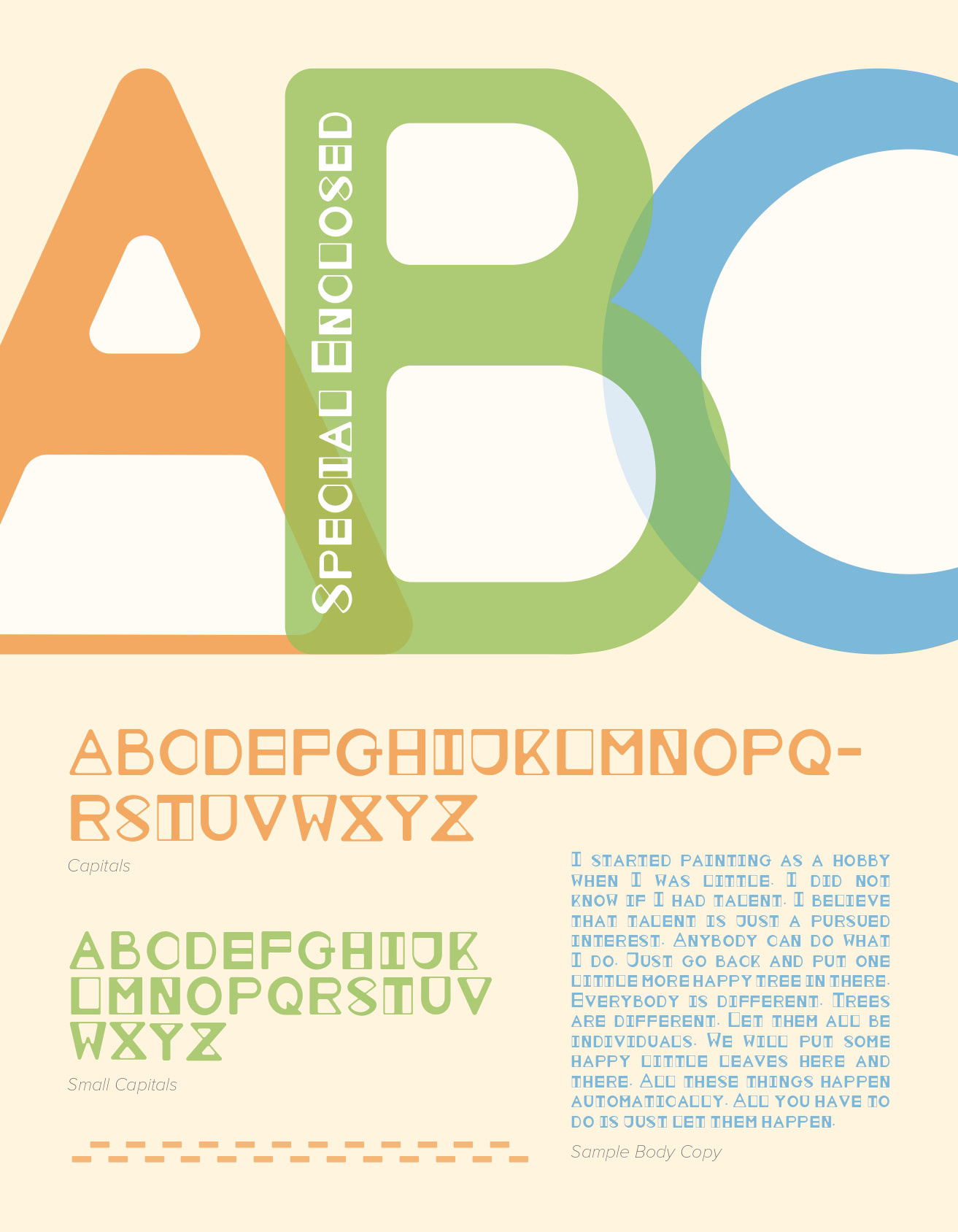
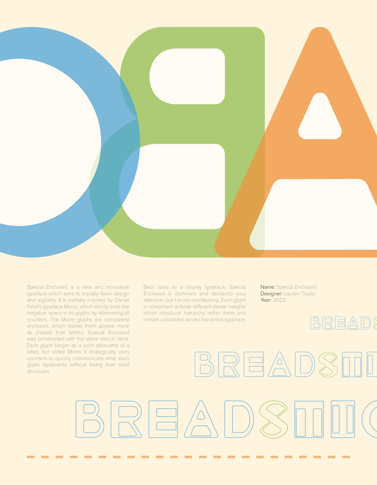
This is a specimen for a display typeface I designed called “Special Enclosed.” I was inspired to create it after seeing Daniel Feldt’s typeface “Morro,” which uses solid shapes as glyphs and requires readers to identify the letter by its silhouette alone. Special Enclosed is made of capital and introduces negative space back into the solid shapes.
